All of the World’s Money and Markets in One Visualization
In the current economic circumstances, there are some pretty large numbers being thrown around by both governments and the financial media.
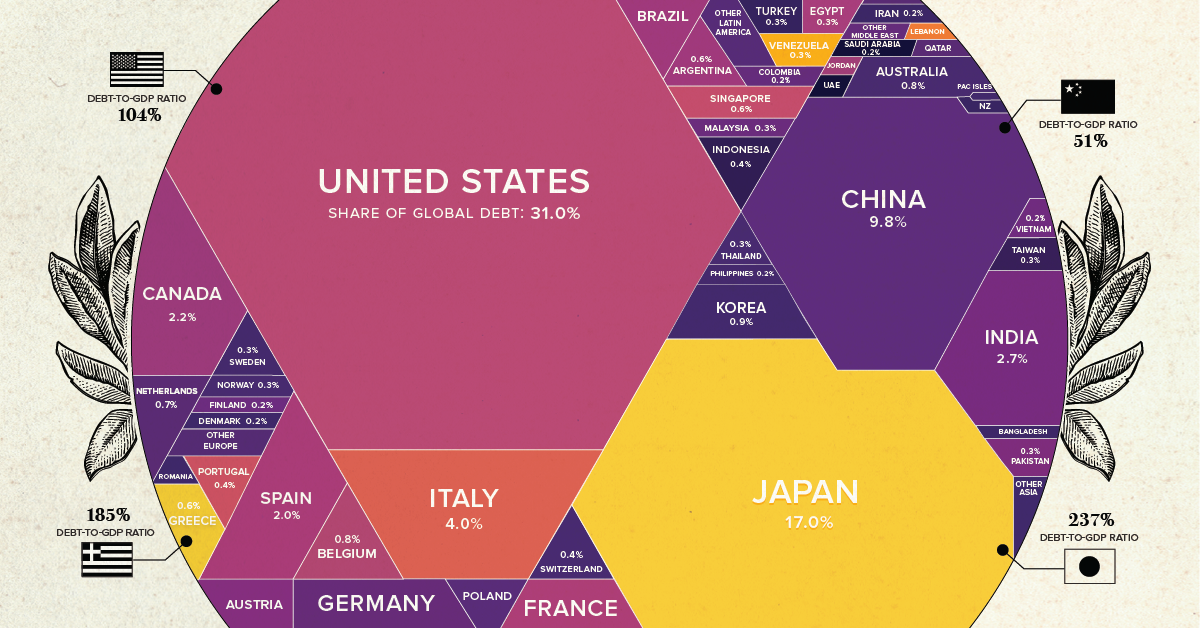
The U.S. budget deficit this year, for example, is projected to hit $3.8 trillion, which would be more than double the previous record set during the financial crisis ($1.41 trillion in FY2009). Meanwhile, the Fed has announced “open-ended” asset-buying programs to support the economy, which will add even more to its current $7 trillion balance sheet.
Given the scale of these new numbers—how can we relate them back to the more conventional numbers and figures that we may be more familiar with?
First published: May 27, 2020 (link)
Source files included: .ai, .eps, .pdf
Data source: World Silver Survey 2019, CoinMarketCap, World Bank, U.S. CBO, BIS, U.S. Federal Reserve, Forbes, World Gold Council, Fortune 500, WFE, CIA FActbook, IIF Debt Monitor, Savills Global Research, Credit Suisse, BIS
A full license grants you the permission to download and modify our visualization, and to re-publish it in most professional and personal use cases.
Licenses also give you permission to translate our visualizations into another language, provided that you also remove the Visual Capitalist branding.
| Type of License | Full License (1 Credit) |
|---|