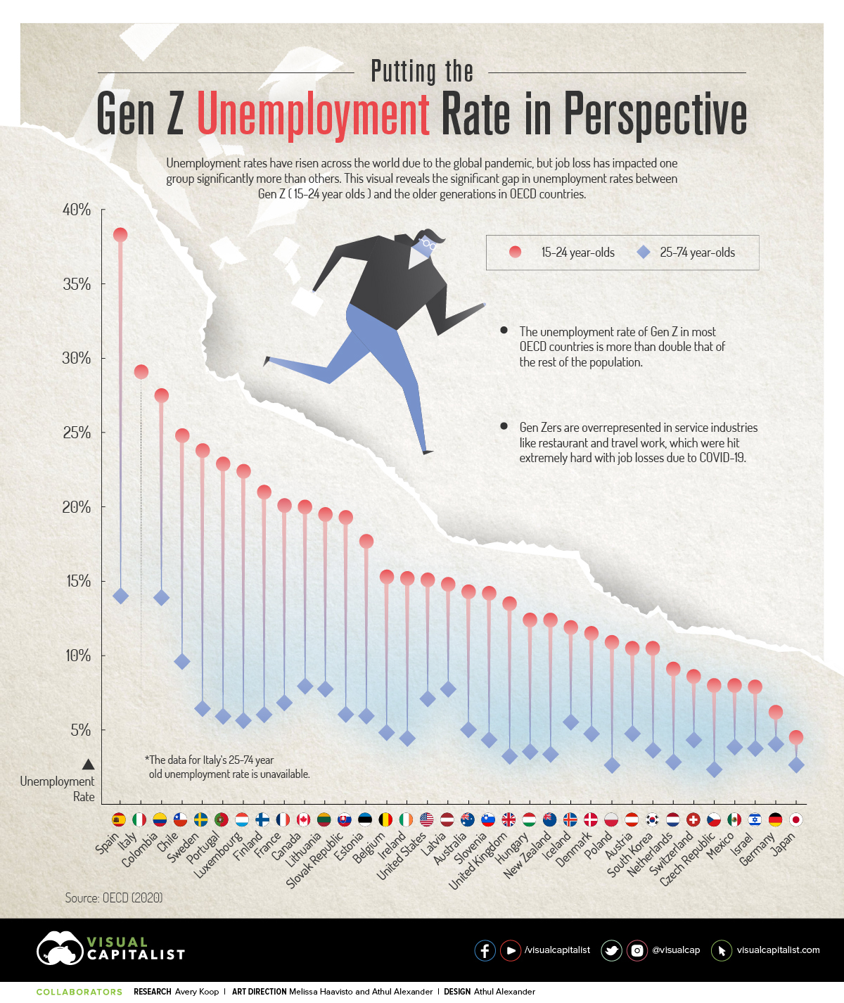
Charted: The Gen Z Unemployment Rate, Compared to Older Generations
There are more than 2 billion people in the Generation Z age range globally. These individuals, born between 1997 and 2009, represent about 30% of the total global population—and it’s predicted that by 2025, Gen Z will make up about 27% of the workforce.
Due to the global pandemic, unemployment has been on the rise across the board—but Gen Z has been hit the hardest. This infographic, using data from the OECD, displays the difference between the unemployment rate for Gen Zers and the rate for older generations.
First published: March 23, 2021 (link)
Source files included: .ai, .eps, .pdf
Data source: OECD 2021
A full license grants you the permission to download and modify our visualization, and to re-publish it in most professional and personal use cases.
Licenses also give you permission to translate our visualizations into another language, provided that you also remove the Visual Capitalist branding.
| Type of License | Full License (1 Credit) |
|---|