The Fed’s Balance Sheet: The Other Exponential Curve
As the threat of COVID-19 keeps millions of Americans locked down at home, businesses and financial markets are suffering.
For example, a survey of small-business owners found that 51% did not believe they could survive the pandemic for longer than three months. At the same time, the S&P 500 posted its worst first-quarter on record.
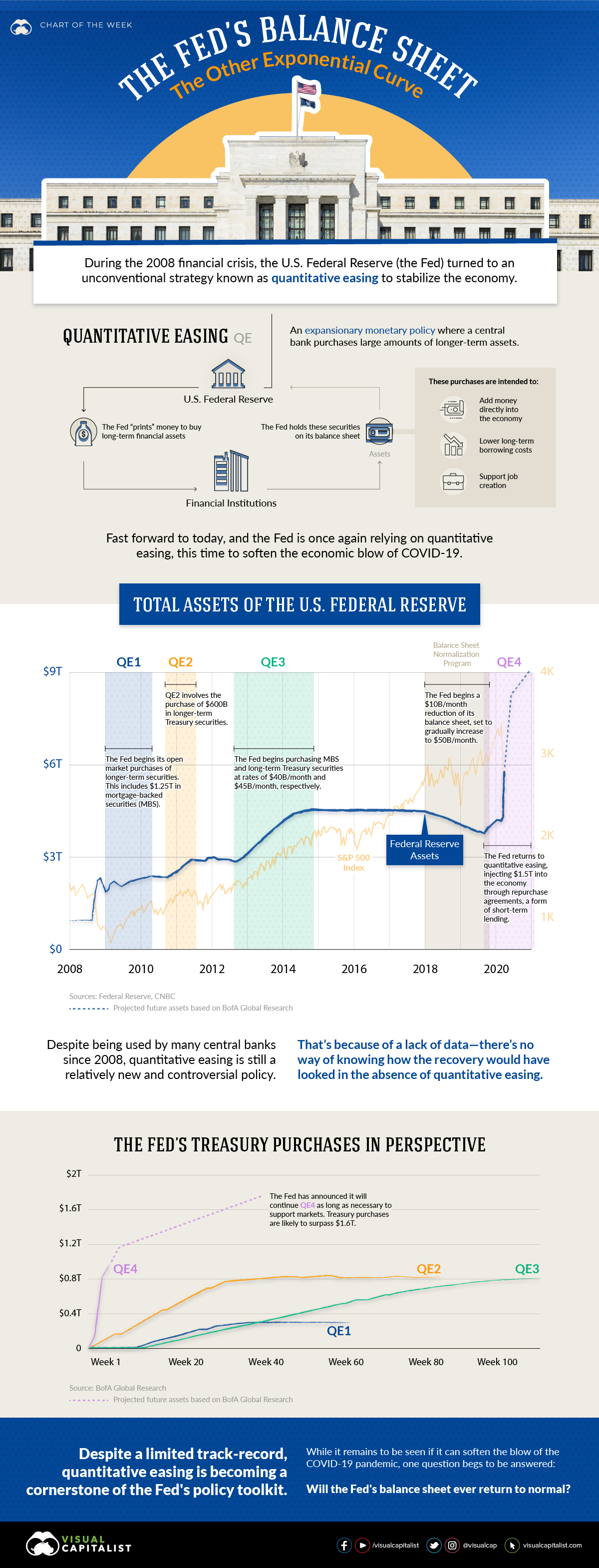
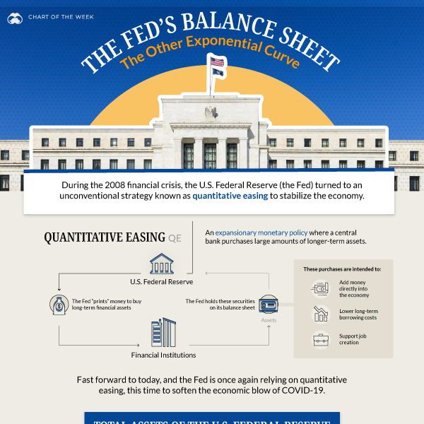
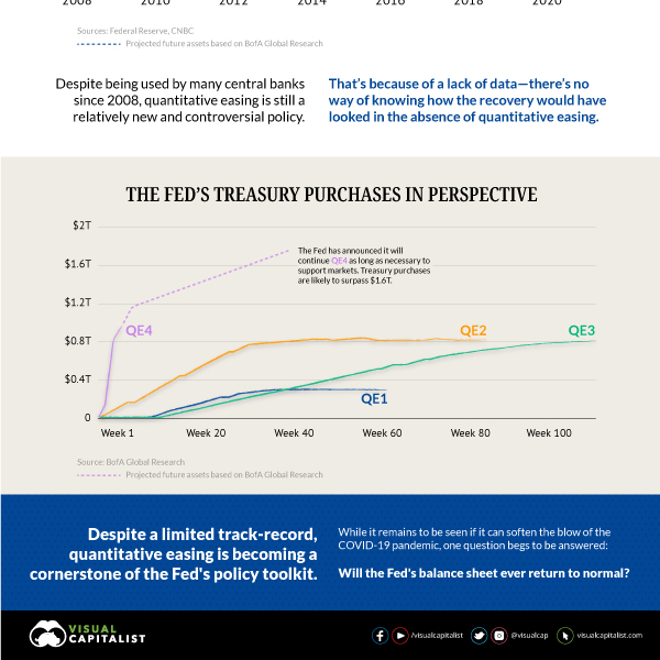
In response to this havoc, the U.S. Federal Reserve (the Fed) is taking unprecedented steps to try and stabilize the economy. This includes a return to quantitative easing (QE), a controversial policy which involves adding more money into the banking system. To help us understand the implications of these actions, this infographic illustrates the swelling balance sheet of the Fed.
First published: April 10, 2020 (link)
Source files included: .ai, .eps, .pdf
Data source: Federal Reserve, CNBC, BofA Global Research
A full license grants you the permission to download and modify our visualization, and to re-publish it in most professional and personal use cases.
Licenses also give you permission to translate our visualizations into another language, provided that you also remove the Visual Capitalist branding.
| Type of License | Full License (1 Credit) |
|---|


