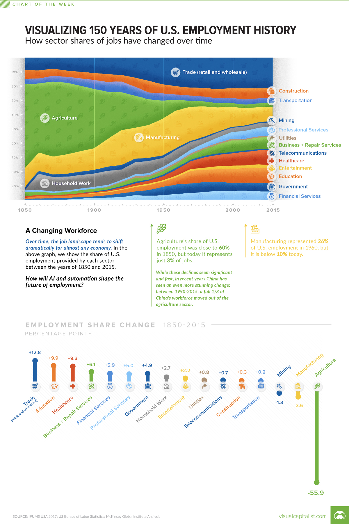
Visualizing 150 Years of U.S. Employment History
How has the share of total jobs changed over time by sector? This compelling chart shows over 150 years of U.S. employment history by industry.
First published: February 22, 2019 (link)
Source files included: .ai, .eps, .pdf
Data source: IPUMS USA 2017; US Bureau of Labor Statistics; McKinsey Global Institute Analysis.
A full license grants you the permission to download and modify our visualization, and to re-publish it in most professional and personal use cases.
Licenses also give you permission to translate our visualizations into another language, provided that you also remove the Visual Capitalist branding.
| Type of License | Full License (1 Credit) |
|---|