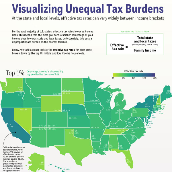
Visualizing Unequal State Tax Burdens Across America
Data shows that low and middle-income families pay a much greater share of their income towards state and local taxes than wealthy families.
This visualization uses data from the Institute on Taxation and Economic Policy (ITEP) to map the effective tax rates—or taxes paid as a share of family income—across income groups at the state and local level.
First published: January 23, 2020 (link)
Source files included: .ai, .eps, .pdf
Data source: Institute on Taxation and Economic Policy (ITEP)
A full license grants you the permission to download and modify our visualization, and to re-publish it in most professional and personal use cases.
Licenses also give you permission to translate our visualizations into another language, provided that you also remove the Visual Capitalist branding.
| Type of License | Full License (1 Credit) |
|---|


