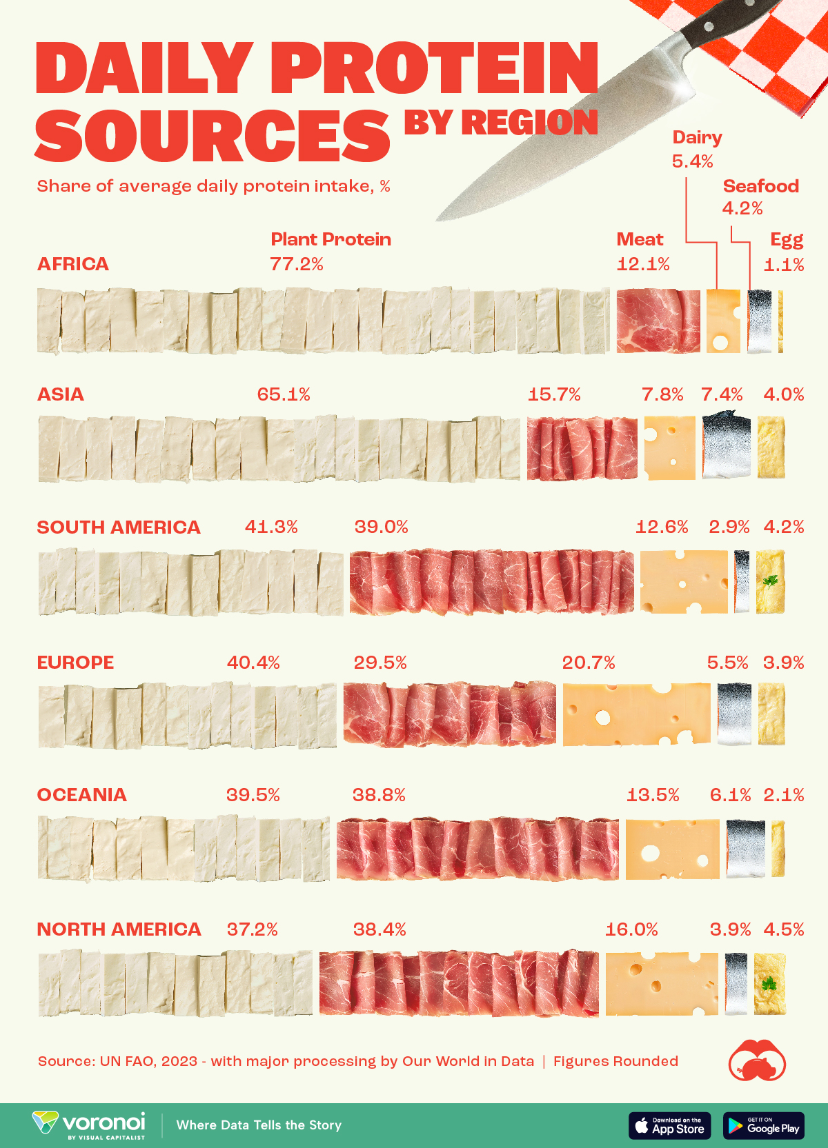
Visualizing Daily Protein Sources by Region
Here, we break down how people around the world get their protein intake.
First published: May 25, 2024 (link)
Source files included: .ai, .jpg, .csv
Data source: UN FAO (2023) – with major processing by Our World in Data
A full license grants you the permission to download and modify our visualization, and to re-publish it in most professional and personal use cases.
Licenses also give you permission to translate our visualizations into another language, provided that you also remove the Visual Capitalist branding.
| Type of License | Full License (1 Credit) |
|---|