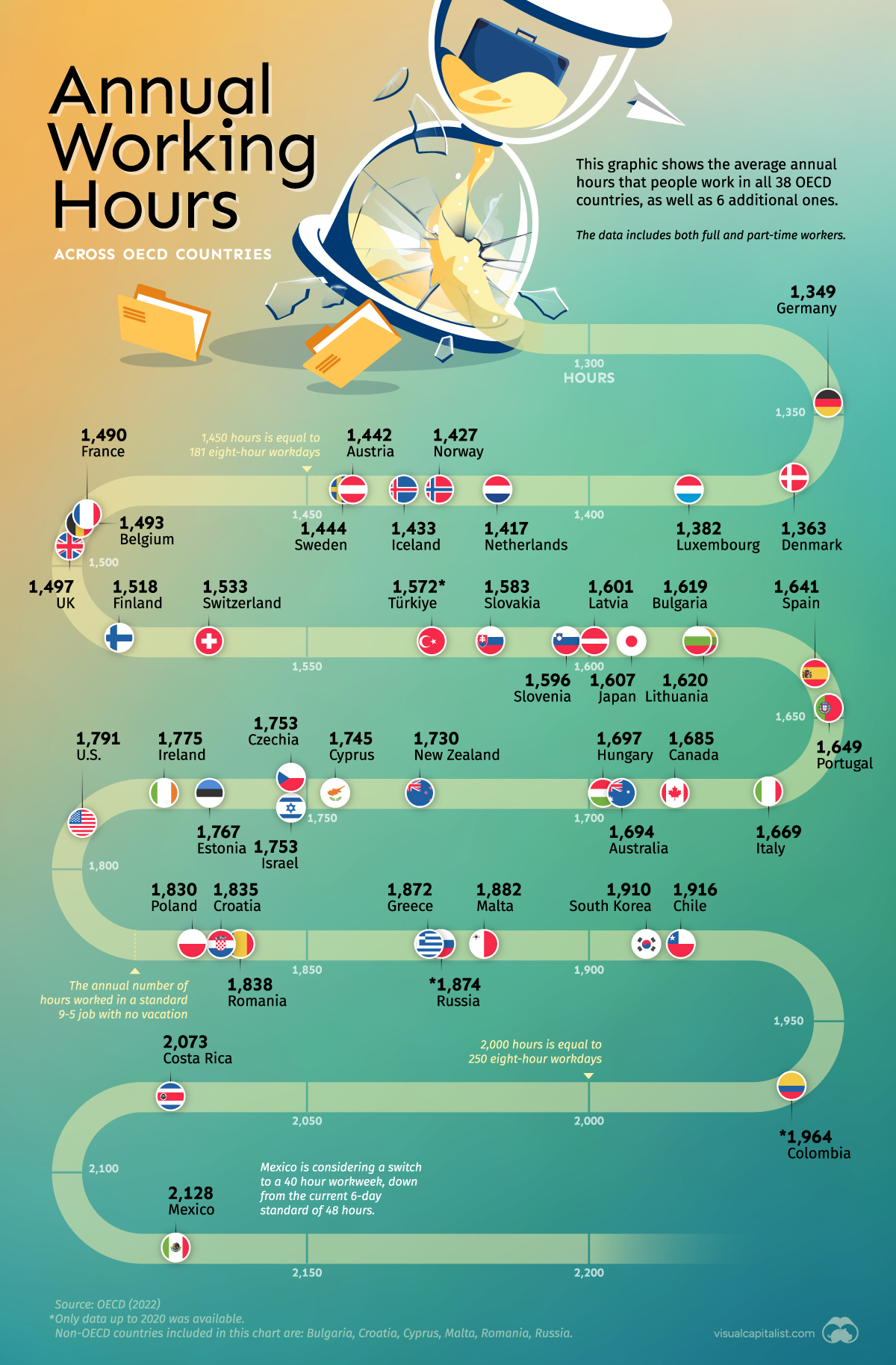
Visualizing Annual Working Hours in OECD Countries
Where do people work the most? Explore our analysis of the average annual working hours across OECD countries.
First published: June 6, 2023 (link)
Source files included: .ai, .eps, .pdf
Data source: OECD (2022)
A full license grants you the permission to download and modify our visualization, and to re-publish it in most professional and personal use cases.
Licenses also give you permission to translate our visualizations into another language, provided that you also remove the Visual Capitalist branding.
| Type of License | Full License (1 Credit) |
|---|