All the World’s Carbon Emissions in One Chart
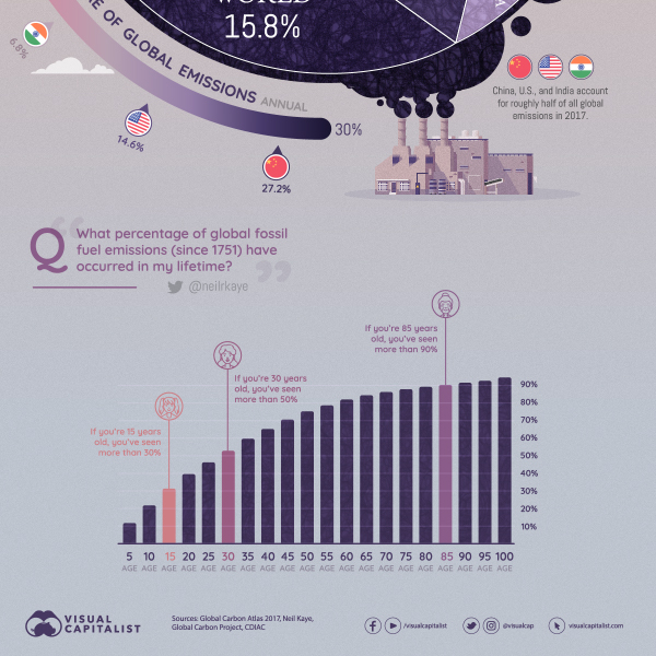
Over two centuries of burning fossil fuels have added up, and global decision-makers and business leaders are focusing in on carbon emissions as a key issue.
This chart uses the most recent data from Global Carbon Atlas to demonstrate where most of the world’s CO₂ emissions come from, sorted by country.
First published: May 31, 2019 (link)
Source files included: .ai, .eps, .pdf
Data source: Global Carbon Atlas 2017, Neil Kaye, Global Carbon Project, CDIAC
A full license grants you the permission to download and modify our visualization, and to re-publish it in most professional and personal use cases.
Licenses also give you permission to translate our visualizations into another language, provided that you also remove the Visual Capitalist branding.
| Type of License | Full License (1 Credit) |
|---|


