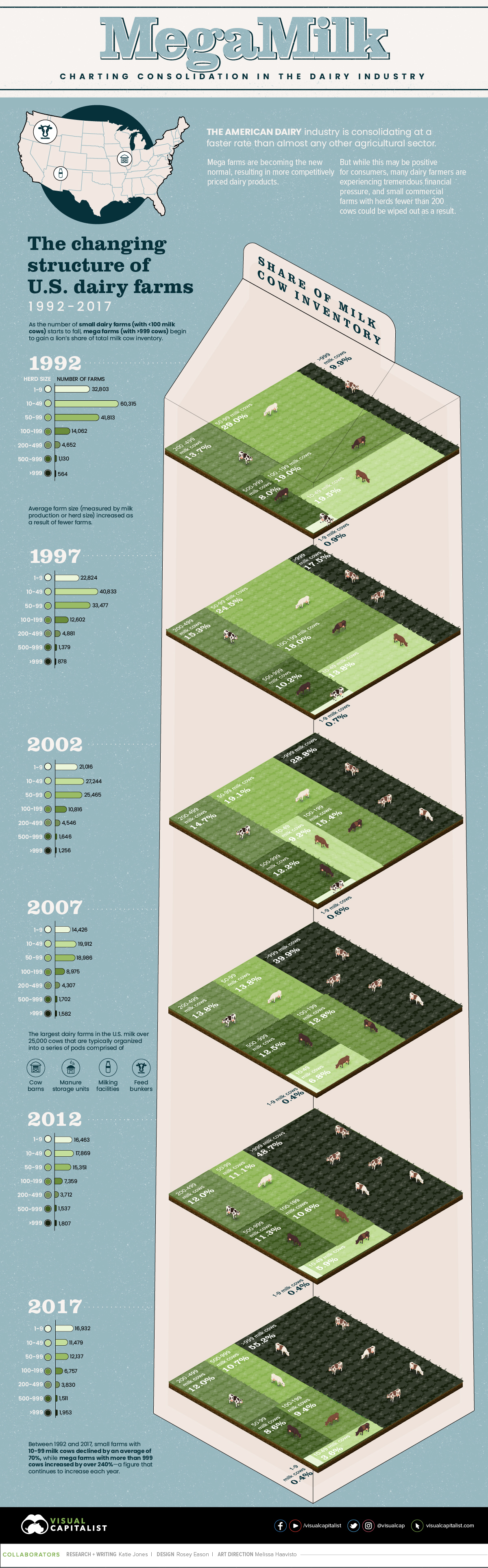
MegaMilk: Charting Consolidation in the U.S. Dairy Industry
Today’s dairy industry looks very different to how it did just 30 years ago.
Milk production in the U.S. has increased by a whopping 50% over that time frame—yet, the total number of dairy farms has dropped by three-quarters.
Fewer and larger farms now have the lion’s share of all U.S milk cow inventory. While they have the ability to produce more competitively priced dairy products and provide more value to consumers, it is causing financial devastation for small farmers.
This infographic uses data from the USDA to chart the rapid consolidation of the American dairy industry between 1992 and 2017.
First published: August 21, 2020 (link)
Source files included: .ai, .eps, .pdf
Data source: USDA
A full license grants you the permission to download and modify our visualization, and to re-publish it in most professional and personal use cases.
Licenses also give you permission to translate our visualizations into another language, provided that you also remove the Visual Capitalist branding.
| Type of License | Full License (1 Credit) |
|---|