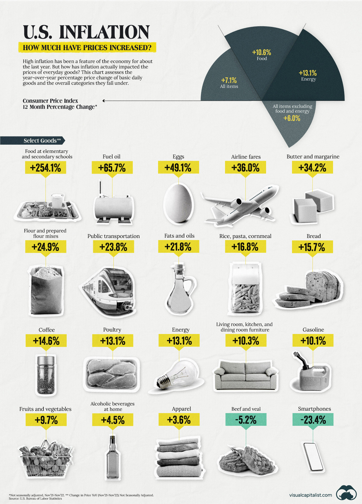
U.S. Inflation: How Much Have Prices Increased?
How has inflation impacted everyday goods like milk, flour, or fuel? This chart shows the annual change in the price of basic daily goods.
First published: December 30, 2022 (link)
Source files included: .ai, .eps, .pdf
Data source: U.S. Bureau of Labor Statistics (BLS)
A full license grants you the permission to download and modify our visualization, and to re-publish it in most professional and personal use cases.
Licenses also give you permission to translate our visualizations into another language, provided that you also remove the Visual Capitalist branding.
| Type of License | Full License (1 Credit) |
|---|