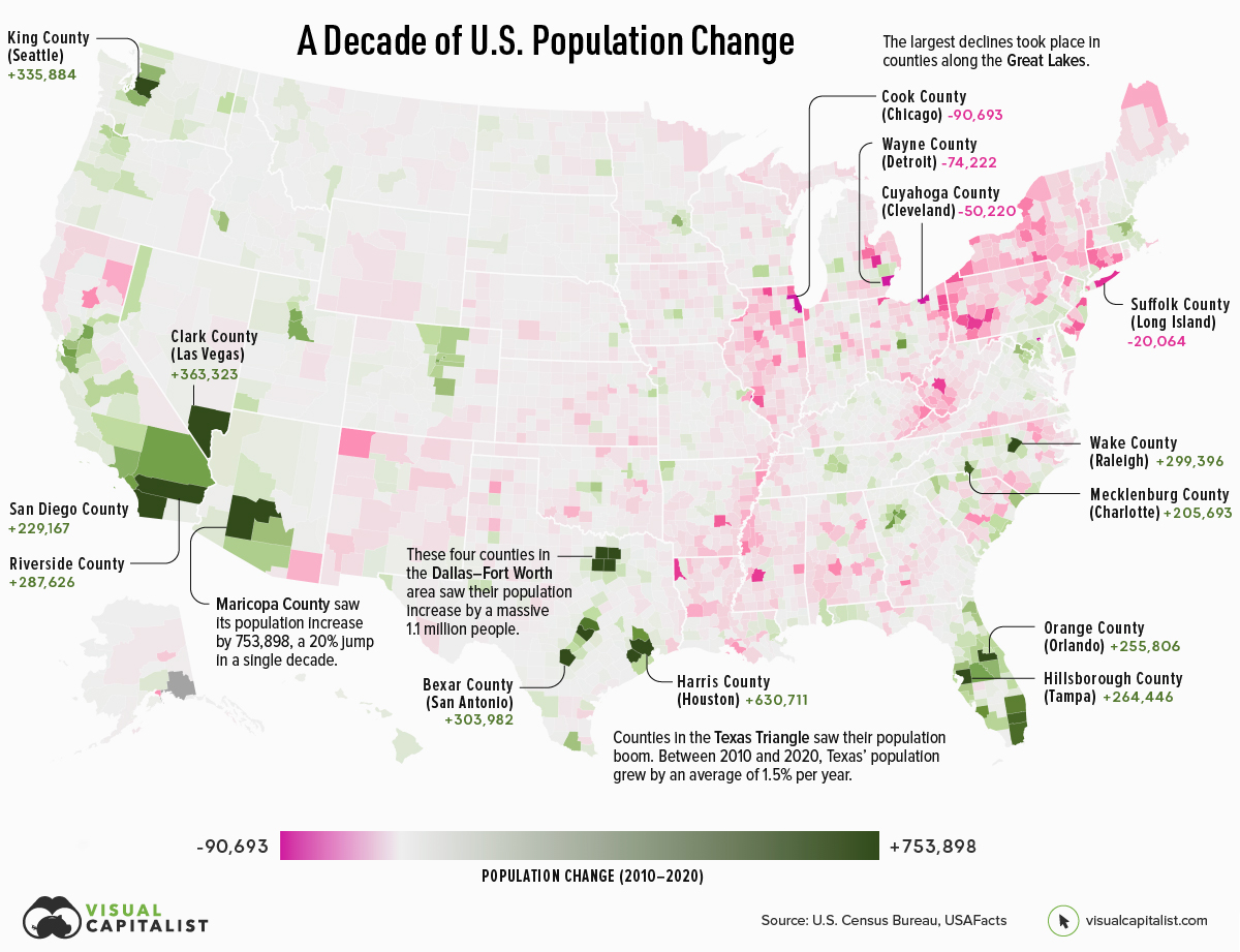
Mapped: A Decade of Population Growth and Decline in U.S. Counties
This map shows which counties in the U.S. have seen the most growth, and which places have seen their populations dwindle in the last 10 years.
First published: June 16, 2022 (link)
Source files included: .ai, .eps, .pdf
Data source: U.S. Census Bureau, USAFacts
A full license grants you the permission to download and modify our visualization, and to re-publish it in most professional and personal use cases.
Licenses also give you permission to translate our visualizations into another language, provided that you also remove the Visual Capitalist branding.
| Type of License | Full License (1 Credit) |
|---|