Visualized: Polarization Across 28 Countries
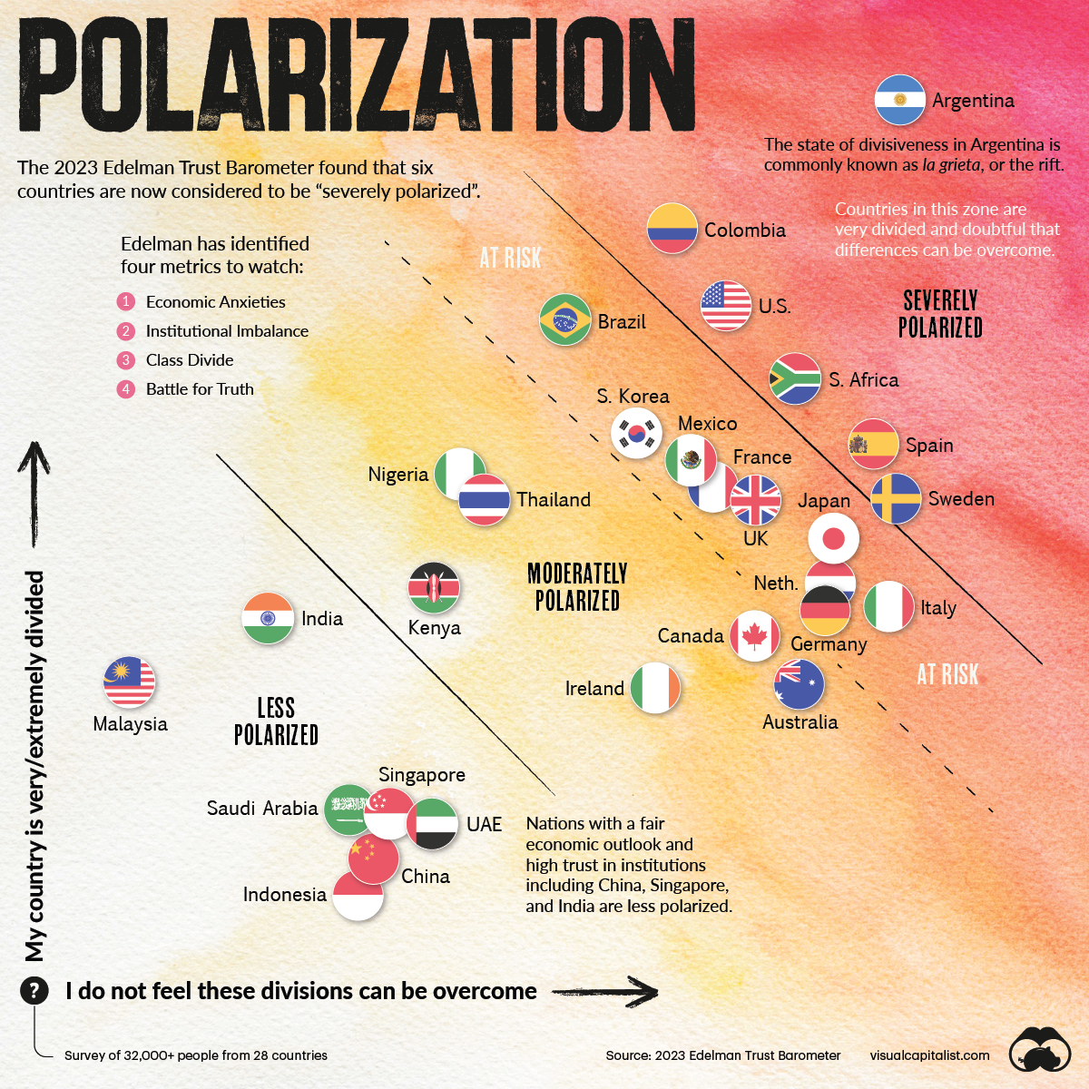
This chart plots polarization for various countries based on the Edelman Trust Institute’s annual survey of 32,000+ people.
First published: January 18, 2023 (link)
Source files included: .ai, .eps, .pdf
Data source: 2023 Edelman Trust Barometer
A full license grants you the permission to download and modify our visualization, and to re-publish it in most professional and personal use cases.
Licenses also give you permission to translate our visualizations into another language, provided that you also remove the Visual Capitalist branding.
| Type of License | Full License (1 Credit) |
|---|