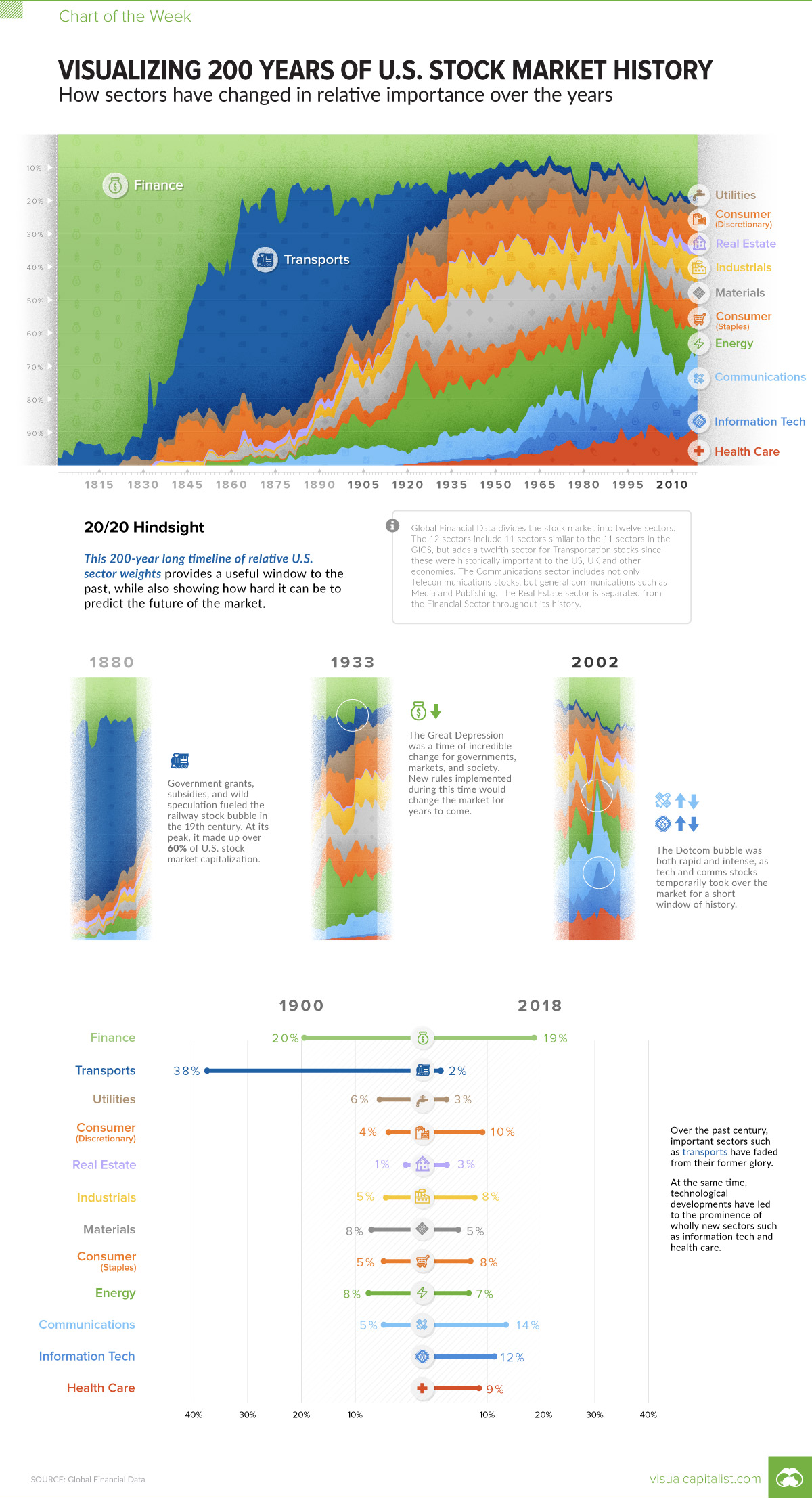
Ranked: Visualizing 200 Years of U.S. Stock Market Sectors
How has the composition of the market changed over time? This incredible chart plots U.S. stock market sectors over 200 years to reveal how much it’s changed.
First published: January 25, 2019 (link)
Source files included: .ai, .eps, .pdf
Data source: Global Financial Data
A full license grants you the permission to download and modify our visualization, and to re-publish it in most professional and personal use cases.
Licenses also give you permission to translate our visualizations into another language, provided that you also remove the Visual Capitalist branding.
| Type of License | Full License (1 Credit) |
|---|