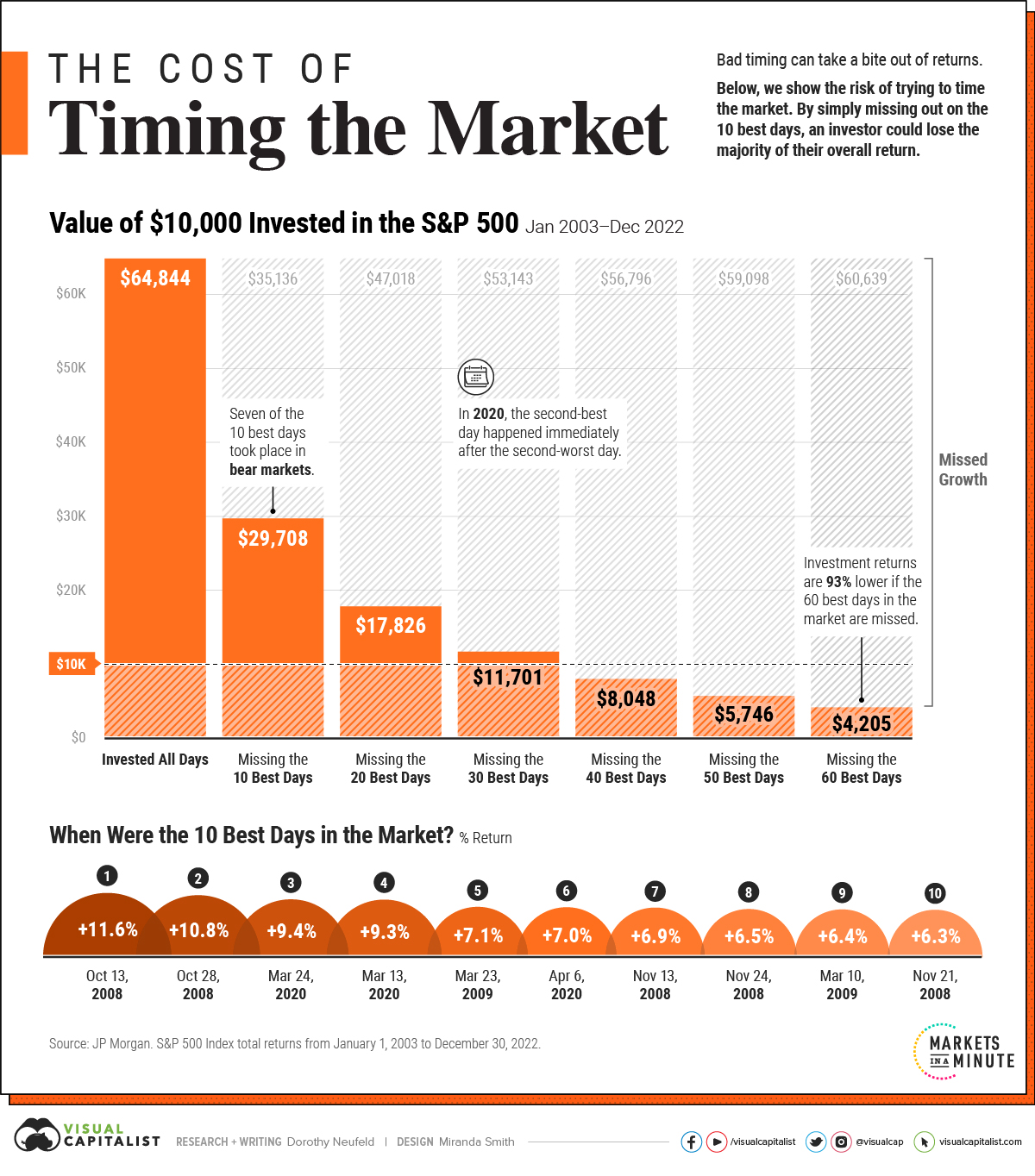
Timing the Market: Why It’s So Hard, in One Chart
In this graphic, we show why timing the market is extremely difficult, and how it can meaningfully dent portfolio returns.
First published: August 14, 2023 (link)
Source files included: .ai, .eps, .pdf
Data source: JP Morgan, S&P 500 Index total returns from January 1, 2003 to December 30, 2022
A full license grants you the permission to download and modify our visualization, and to re-publish it in most professional and personal use cases.
Licenses also give you permission to translate our visualizations into another language, provided that you also remove the Visual Capitalist branding.
| Type of License | Full License (1 Credit) |
|---|